cartoon poster

final project

This is the last project we did in exploring technology. For every different selection to color in I made a new layer. First of all we started out with a black and white picture and we had to color it in and also take a picture and cut our selves and put it in the building when the finish product was finished. I started with the sky I used the quick selection tool I selected only the top part and if there was any selection I didn't want then I used the negative sign then choose the color and used the paint bucket tool. Then I went to the top and changed it to like soft blend something like that and it made the color look better and realistic, as you could see its dark on the top and light in the bottom. Then I made a new layer and started coloring the ground, for that one I used the polygonal lasso tool because the quick selection tool didn't work. The polygonal lasso was also easy to use you just had to make likes then it will select what you've gotten then I choose the color brown but with the thing in the top it made it also look more realistic and like more lighter. Then I did the pool and the windows and the door. The building I choose dark red and colored it in also with the polygonal lasso tool and repeated the same steps. There was this point I got that the polygonal tool didn't select all I wanted and didn't want to select it all over again so I used the brush tool and just painted the left overs. Also if I colored it in to much I used the eraser tool to take it off. The other tool I used in this assignment was the eyedropper tool, I used it when I needed to paint but didn't knew the color so I used the eyedropper and gave me the same color. We opened a new document and cuted our selves out by taking the background out then I put them in the building. The images had different texture of shading and that didn't look good so then I when I used the vector mask that tool made the images look brighter or darker, and then I made Divine darker and then I used it to me I made myself lighter somewhat then also the background it was to dark so I made it look lighter/ brighter. This project was awesome.
watter bottle design ad

This is a water bottle I design in exploring tech. This water bottle that I designed is a drink that takes you to the future. I chose to do this drink because many people say that they wish they could go to the future and that time could be faster and now this is a drink that takes you to the future. Also because I would like to know the future and just go. How I did this water bottle design was with illustrator its a program we use to create things in the computer. I started out with using the pen tool and started making lines and curve lines then I converted it in 3D. I also used pucker and bloat. I used that in my design for the text. The last thing I used was the shapes to make the background. The purpose of this project is on how to improve your life. What I learned in this project was how to put the symbol in my water bottle using the map art. What I want people to notice in my water bottle design is the monochromatic I used for example all different types of blue.
Water bottle s design

|

|

|
These are my three water bottles I design in Illustrator. I used the pen tool, I only made half the water bottle then I made it into 3D. Then the designs I made 3 different ones then I put them in the water bottles. The first one was made with only 4 anker point, the second one I used 3 anker points, and the third one I made it with 4 anker points. When I plugged in the designs into the water bottles I went to effect>3D> and revolt. My favorite one was the last one it looks more like a water bottle than the other ones. What I want the people to notice is that you could create many things in illustrator.
dolphin trace

In this mini assignment I had to trace a dolphin with the pen tool. When I finished tracing it I started making the waves with the pen tool and making curves. Then I colored it in. Finally I made the background like the sun was going down. What I want people to notice is that I made everything using pen tool.
butterfly tracing using pen tool

In this mini assignment I used the pen tool to trace the butterfly. All I did was trace half of a butterfly using a little bit of ainker points. When I finished that I flipped the butterfly vertically. What I want people to notice in this assignment is that I used the pen tool.
about me video

From the green screen video this is the part that I decided to screenshot because it wasn't blurry and my face was side ways. What's happening in this picture is that Im talking about Luis Coronel.
|

This is just a screenshot from one of the 5 pictures of the person I admire. I screenshot while the words were coming up so the brightness would appear. What's in this picture is just a person I admire.
|
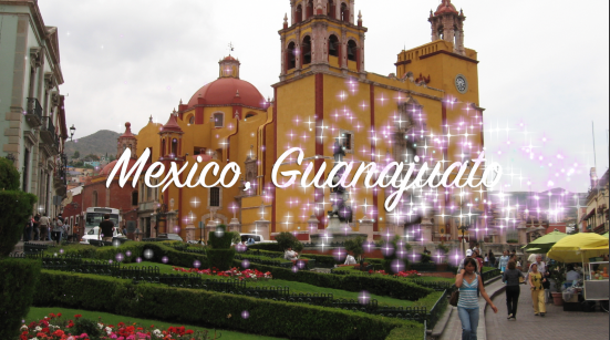
This is another picture that I screenshot from one of the 5 places I would want to go. What's here is a place I want to go visit when I grow up. It's Mexico, Guanajuato.
|

This is a screenshot of a quote and I made a voice over. I just thought it was a good picture because it's part of the quote. What's this is a quote.
|

This is a screenshot of a work i've done in the class. I picked it because I liked that work it was easy. What's happening in this picture is that I became small and meet a penguin that helped me get back to my normal size.
|
This project was assign for digital art. We've been working for this video for a while. What we had to do was create a video about ourselves, for example add pictures and videos etc. The project is going to let other people know some more about yourself. The video was created in iMovie. What the video needs to be included was 5 pictures of places you'll liked to visit/ you like, 5 pictures of your favorite foods, 5 things you like to do, 5 pictures of people you admire or you have respect for, a green screen, interview, a quote, pictures of some of your work in class, music but that was optional, and credit ending. By doing this video I learned things I wouldn't imagine I would've learned, for example the programs we used like adobe premiere and iMovie. For the green screen I used the program adobe premiere, it's really easy theres just like 5 steps. What I learned about that was how to take the green screen off and put the image you want in the back and if theres any green spots you could take it off. Also the iMovie thats were I made the whole video, I learned how to make a video and that theres color correction, titles, and more things. What this project made me grow in skills, creativity, and knowledge was by learning stuff I didn't knew and now I do, also by taking my time on doing this project and trying to make it as good as I could. What I want people to notice in my video is to try and see if they could tell how I am, also to see if people have similarities or differences in their video. I really liked this project it was really fun to do, and I learned a lot new things.
cartoon character

In this assignment what I did was create a character for a cartoon we suppose to do in a group. We had to make it original I kind of made it original because I changed some things that I was mimicking. My character's name is Donisha she's a border patrol police. She has no fingers and has hair and the red dots are eyes. How this character interacts with the other two characters is nothing because they have the opposite characterization, in the story the other ones are mexicans and funny, talkative and the donut is american and so lame and scary. Also they interact by them three being original and weird. What I want people to notice is that the donut is funny and with those eyes represent mean and inpatient. A little bit of a background is that Donisha wanted to catch 2 un- american persons but she never did because the other ones made her get in bad condition. live painted it in illustrator, it only took me like 7 minutes. The car I just made it with the objects, the circle, curvy line, line, rectangle, then I just used the type tool to make the letters.
Image Trace and Live Paint
illustrator
|
photoshop
|
In this mini assignment we had to draw anything we wanted but for me I drew rapunzel. I drew rapunzel because it's my favorite princess. The left one was made in illustrator and the right one was made in photoshop. First of all we had to scan the drawing and then open it in illustrator or either photoshop. The difference between illustrator and photoshop is that one we used the paint bucket and the other one we used the quick selection tool. Also because in the left one it's more clear and the right one it's kind of more plain. I liked the one that was made in illustrator because it's easier to work with the tools and I used the paint bucket. What the multiplier layer blending tool did was it made the back white paper clear.
cooking plates before and after
before
As you could see theres a before and after picture of some brown rice. What we had to do in here was to make the picture better because the pictures were going to use them in a project we have in BioLit. >>>>>>>>>>>>>>>>>>>>>
before
In this picture it's the same as the top one. I cropped it so it would only focus on the plate. This picture was taken by Matthew with a camera. I really didn't do that much of a difference I only cropped it and made it more white and looks focus.
|
after
All I really did here was crop the edges to make it focus in the main plate not in the outside. In the original picture it was kind of blurry and not really focus. Then I fixed it by using photoshop.
after
|
Glitch mob wallpaper design

This project is called Glitch mob wallpaper design what we had to do in this mini assignment was to design the same design again but without steps/ instructions. I guess the easier way to do this is by fist making a big triangle, making a smaller triangle and connecting it to the top of the other triangle, then copy 2 times the triangle and connect them to the other corners of the triangle, make a line going in the middle of the big triangle, make a circle and copy and paste so you have 2, connect the corners of the triangle, create a bigger triangle outside the big triangle, finally create a bigger triangle outside the biggest one. That's the easy way for me to create this design it takes only 8 steps. The rest is just the background and the little triangles with pattern. The background I just got it in a website its space. I choose that background because it wasn't that exaggerated or like it didn't have that much detail/ color. The triangles in the back we just did it in adoble illustrator we just made a small triangle and make it into pattern. Then we copied and passed into photoshop, and dropped the capacity. The whole product was in photoshop.
exaggerated scale 3

It was an early windy snowy day when my friends came over to hang out in my house, we were having so much fun for some couple hours we were eating, listening to music, watching movies, singing and a lot more things. When we got nothing else to do we got bored and just sat down on the couch. We were thinking about what we could play or do, I was going to say something when Lupita just screams "I know, lets play "war" outside". We all ran outside and it was so cold that we when inside and put on a jacket and then return back outside. My family had a mini farm of different animals and we went to take out, I choose the moose, Lupita choose a weird animal, and Veronica choose a tiger, the rest of the animals were just there aside us. As we were putting the animals in position all of the sudden the weather changed to really hot it was really sunny and everything wasn't fill with snow it was all green. We looked up and the animals were huge we were small. We were scared we tried running inside the house but we couldn't see nothing because of the large green grass and it would take us months to pass the whole yard to go into the house. I ran behind a tree and hide, I heard some foot steps it was the moose it came up to me and said don't worry we won't hurt you girls, so we went together and got even more scared because the animals were getting closer to us. One of the animals there picked me up and put me in his back and so as the others. They were like "y'all ready for some fun" "we love playing "war" do you girls want to play" we answered "yes, of course that's what we were going to play before we became small. It was getting dark and we had to go back inside the house, so the animals were so kind to take us back to the house and when we stepped the inside everything when back to normal we were back to our normal size and it was freezing cold again outside. The animals when back to the cages or "farm." As we got back into the house that's how we came back to normal. It was the best day ever.
jOURNAL
The assignment thats representative of my best work this quarter is the pattern design. I think this is my best work because it's creative and easy to make. I remember how to do this more than the other assignments before. All I had to do in that was make 3 or more but of the same shape, make one big and the rest in the inside. Also we had to use color harmony that means use a color but with different type of shades. Then I pucker and blowed it so it became a flower. Then I did the pattern. I really liked this assignment and I think it's my best work.
Thinking about growth mindset I would like to improve the second scale because I can't really see my self and I actually tried brighten myself so I could look like him. I would just use another picture. Also the shirts I think I could of done better but it's hard thinking about how to do them and stuff. I tried doing creative designs but they wouldn't look good.
Thinking about growth mindset I would like to improve the second scale because I can't really see my self and I actually tried brighten myself so I could look like him. I would just use another picture. Also the shirts I think I could of done better but it's hard thinking about how to do them and stuff. I tried doing creative designs but they wouldn't look good.
EXAGGERATED SCALE 2

Luis Coronel got of the airplane and was in the airport I was so happy to see him so exited. I was next to see him real close but when I was going there I was to exited and thats when I was turning small. All of the sudden I was all the way in the ground, he saw me when I became small and he carried me and took a picture with me then he put me in his suitcase so I could be next to him till he was done with his fans. I got bored so I tried climbing up all the way to the top. Finally he took me with him to his hotel, where he set me on the bed and asked me if I'd like anything to drink or eat, I gave him a nod saying I did want something to drink being small makes you thirsty honestly. when he filled up a cup with cold iced water we looked at each other in a strange expression on our faces as to how I was gonna drink the water. He looked for a straw and got some water into the straw and slowly he put the straw in my mouth and made me drink from it. The straw felt so thick and moist.
It was church water! The Lord helped me grow/ Luis Coronel.
It was church water! The Lord helped me grow/ Luis Coronel.
EXAGGERATED SCALE 1

It was one early morning I was going to my class when I bumped into Divine she had a coffee in her hand and gave it to me she said "here, so you won't sleep in the class". So I took it and I was drinking it while I was getting close to the classroom, but suddenly I felt something weird going on with my body so I stopped for a moment, I was getting goosebumps then they stopped and I started walking again. Again I stopped I saw a huge foot that almost squished me, it was Mr. Means closing the classroom door I ran rapidly inside. When I was inside I was confused of why I was small all my stuff that I had with me was small just like me, then i remembered that my friend said "this will make you different" but I didn't knew what she was talking about I thought she ment like I would be energetic or something but no turned out it made me small. I was trying to figure out how to get Mr. Means attention but he couldn't see me down in the floor. I was thinking of another thing when Lupita and Veronica saw me in the floor they grabbed me and put me in the table then I was trying to tell them to help me but they couldn't hear me. Suddenly Mr. Means came to them and asked if they needed help, they rapidly hidden me aside their chair but then I feel back to the ground. When he finished helping them he left and they were like "and Cristina where did she went?" I was all the way to were the piano was because I was scared people would step on me. While I was looking around I heard a voice coming through the back of me it was a penguin he been small for a long time, then he asked how did I became small and I told him. Later on he was trying to help me get Mr. Means attention but still we couldn't because we were to small. We went to Veronica and Lupita but they weren't in their seats because they went to the bathroom so we still couldn't get no ones attention. Mr. Means called everyone in front, suddenly a kids flashlight feel off and we ran to it and grabbed it, it was heavy thou but still we grabbed it, what we did with that was point it at Mr. Means face so we could see us. The light was bothering him and when to see what was it and finally found us. He got surprised and grabbed us both and put us in the table. He called the office and they were going to take me away, but first I gave a kiss to the penguin to thank him for everything he did for me and making the teacher find us, all of the sudden I felt the same way I was feeling when I drinked the coffee and I never expected nothing when I came back to me big. The thing that got me back was the penguin kiss in the cheek. Thanks to him i went back to me.
sweater for school

This is the sweater I did for the school. The colors I used were purple. I used it because it's like the main color of the school. The requirements were to write "sacramento new tech" or "sacramento new technology". I choose the first one because it was shorter then the other one. The font I used was sf-collegiate.
shirt for school

This is the shirt I design for the school. WhatI did was just put the text in it and the design. I choose the font called sketch- college. The colors I used was purple and grey because there the school colors.
Iphone icon

The last challenge was making a iPhone icon. The requirements for this one were to use shapes, radial balance and transparency. The shape I used was a oval. When I did all of the shapes I lowered down the transparency to 50%. This icon didn't came as good as I was planing it to be.
shape using rythm

In this 2nd challenge the requirement was just to create a simple radial balance design. The shape I used was a star i think. When I created the star I used pucker and blur that made my shape look different. Then I went to transform and created this design. Then the second step was to use the live paint bucket to create a color rhythm. I decided to only paint one section and another one no. I just used 3 different types of color that matched to each other and colored them in.
3d cube

In this mini assignment (one of the 3 challenges) I had to make a 3D cube. We could do it any way you could. The thing I did was use a square. I did one then copied and pasted so all could be the same size. The first step was that I made a square then copied that and pasted and put it next to it then I continued with the rest. The bottom was a little hard to do because I couldn't put it straight. Before I did the bottom one I lower down the visibility of all of them so I could see the lines and know were to put it. I lowered it to 50%. Thats how I got this 3D shape.
design

This is my pattern I did. The requirements were to use color harmony for example use the same color but different shades (monochromatic). The shape I used was a circle I overlapped 3 circles to each other. The first document I used 100 by 100. Then I used the pucker and blow and made it into like a flower, and then I put more options and made this shape. I had a little bit of trouble putting it straight. When I finished that I went to object>pattern>make then I made this. Then I opened another document 800 by 800, and paste. Finally I choose the background color I choose it light green because it matches the pattern. I want people to notice real close to the design that its pretty cool and how the shape is.
my own design

In this last design there wasn't any specific requirements. The only thing I had to do was choosed a scheme. The schemes were saturated, warm, cool, muted, pastel, and we had to use more then 4 colors. The scheme I used were the pastel ones I used them because they looked light and like it was different form the other ones. I did the same thing for this one as well. For this design I used a square but turned it into a diamond. I did the same thing I also used pucker and blur and made it into this weird shape but its pretty. Finally I copied and paste it into a different document.
monochromatic

In this second design the requirements were to use monochromatic colors. Those colors are colors that have the same shade of one only color. For example the colors I used were blue I got them in the kuler packet it has a dark blue, a light blue, and a ugly blue. Then the background I put it baby blue because it would mach perfectly now that I was using monochromatic colors. The shape I used in this one was a star I made it look like this by using pucker and blur. In this one I did the same thing I copied and paste it in another paper/ document.
analogous

In this design the requirements were to use the colors analogous. Analogous are colors that go together in the color wheel for example red>orange>light orange etc. The colors I used in this one were red, orange, and like a darkish red. The shape I used was a hexagon then I used pucker and blur and turn it into like flowers. Then I went to object> pattern> make that let me make them in a pattern. I picked one of 5 different options there were because there were many forms of putting it. Then I made a square using a square, I double tapped it and the pixels I had to use were 800 by 800. Finally I opened another page and copied and paste it in a different document.
product tank top

The product I used was tank top. I used it because everyone could use it (both genders). The colors I got them in the bright stroke. The colors I used were green, red, yellow, blue, and orange. I used one color less than my other team mates because when I tried using all of them six it wouldn't go right it would be uneven. Also as you could see the colors were going to the center so if you pay attention you could see that the lines take you all the way to the middle. I was going to make the design into a pattern to put it in the background, but then I tried it but you couldn't see the design in the background so I just did the original design big by holding alt and shift. What that does it makes the thing you want to make big and it stays in the same position. https://docs.google.com/a/snths.org/presentation/d/1VcfxEUhewBMfsEKVhS-B9GfT9oiO-ga9HEDDfZq4aL0/edit#slide=id.p
shoe

The name of my shoe is ugly zaggy. In this project I used adobe illustrator and lines and made them into zig zags. First of all I blend them together and then when to effect then to disort and transform and click zig zag. All that when into zig zags and then I accommodate into its place. Then I used copied and pasted in photoshop so I could put the zig zags into the shoe. I kind of liked this project because it was really cool and creative. Also because I guess I could create shoes and sell them.
3 t-shirts (monochromatic stripe,analogous stripe,zig zag stripe designs)

This project was kind of easy because all you had to do was pick a shirt any shit color and make lines but make them thicker. This shirt was zig zagged because that was one of the requirements we had to do. In specific requirements were to choose a specific color swatch palette or Kuler palette and create zig zag stripe blend design that changes thickness (zig zag blend can be round or smooth).

I really liked this shirt because it looks "cool" and because I did the little pocket. This was almost the same as the top one. For this one the requirements were to create an analogous stripe design using blend technique. Stripes can be same thickness or vary.

This shirt I made I kind of liked it not to much but its still pretty cool. for this one the requirements were to create a monochromatic stripe design using blend technique (specified steps). Stripes must change thickness in blend.
ratchet t-shirt

The shapes I used used were a star and a circle. I used 4 different type of colors. The colors I used were black, maroon, navy blue, and grey. This colors I got them in the kuler. The degree I used was 20 and the number of copies I used 18. I liked this project a lot because now that I know how to use the tools I could do them easy.
color rhythm

Creating rhythm with color.
radial balance 1,2,3

The last racial balance I used 3 different shapes I used a star, a circle, and a rectangle. The degrees I used were 3 because I couldn't use the same ones. I forgot what were for each but I used the 18 by 20, the 12 by 30, and the 9 by 40 and also used one copy. I kind of liked this shape just cause of the inside. I want people to see the 3 different shapes I used and that I put them together.

In this radial balance I used a circle and a star. The degrees I used were the same as the first one 18 by 20 and used one copy. I really liked this one because of the color its goes with the background. Also because of the design it looks like it has more than one shapes. I want people to know/ see how pretty this is and that it looks creative.

In this shape I used a star and a circle. The degrees I used were 18 times 20 and used one copy. This was a little bit confusing because I got confused in the part were you had to expand appearance. I want people to see the shapes I made in this radial balance.
clipping mask 3

This assignment I choose 5 different pictures from the internet and were about islands in Hawaii. The requirements we had to do were choose 3 pictures one was about the diamond head, the second one was about surfing in Hawaii, and the last one I had to choose a picture about underwater. The other 2 images I just choose islands the islands were lanai and I think it was Niihau. I kind of got better but forgot how to make the pictures go into the letters. I guess I'll forget how to do this next time I do it.
clipping mask 2

|
This assignment was easy now because Ive done it 2 times already. I did this like in 10 minutes. I want people to know that if you practice you will be able to do this. I choose the background green because it combines the grass in the picture.
|
clipping mask 1

|
Ive already did one of these and I had a little bit of trouble. Now that I did this one it was easier because I had experience and it was easier. I learned that you don't have to leave any lines in middle of the pictures thats why I had to use the gardien tool. My animal is an insect its a butterfly. I picked it because we had to choose 3 pics of any animal you want but a butterfly I wanted to make in form of how it grows like the first picture I used a caterpillar, the second one was a cocoon, and the last one I got was a butterfly. All of the pictures I combined them together and thats what I got. Finally the last thing I did was the background. I liked this project because it was pretty.
|
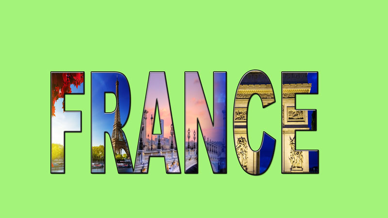
traveling poster
|
I really liked this project because it was fun and creative. I choose France because when I grow up I wanna go to paris. We had to choose 3 pictures from the internet. I had a little bit of trouble on smuggling it or blending it however you want to say it. I want people to notice how pretty this is and also I want them to see how this art class helps you learn a lot of things.
|
5 shapes

The last design I did was using a square, a star and a 3 side star. In this one I also had to reflect it. This requirements were to make a design using blends between 3 or more objects.

This was the fourth one I made I used a circle and a wanna be circle. I had to reflected and they came out like some party lights. In this design the requirements were making a Symmetrical balance design using blends, no fill color and symmetrical balance.

This third design I used lines. I didn't know how to make a shape with this but I just moved it around and reflected it and put it in the other side and finally that came out. This was my favorite design I made specially the color. The requirement in this one was making a Symmetrical balance design using spirograph tool and transform / reflection technique (refer to workshop).

This second design I used was a hexagon. This was almost the same as the first one the only difference was that I used a different shape. This was also easy to do. the requirements here was to make a concentric design using spirograph tool and only stroke color (no fill color).

In this design I used a star shape. All did was grab the star shape and then moving it around holding into the tilde. This shape was easy to do because you didn't have a lot of steps. The requirements we had to do were just using only stroke color (no fill color).
art shapes

This mini project or workshop was a little difficult because I didn't know how to put the shapes together. Also I didn't really like the shape it is. What I learned from this was how to use the tools.
3 points of view

This are my 3 different types of views. First of all we had to bring a small object to class and take pictures of it. First I took a picture of the nail polish with 2 pieces of white paper one in the bottom and one in the back so it would match the color. Also I liked the shadow in the back. The second picture I took it in the piano because it was a different color than the white one. The third one I also I made changes in the pictures in photoshop. All I really did was make the picture look bright.


